

What is media query? It’s a feature of CSS that enable web applications content to adapt to different screen sizes and resolutions. They are a fundamental part of responsive web design and are used to customise the appearance of websites for multiple devices.
Media queries in CSS3 extended the CSS2 media types idea: Instead of looking for a type of device, they look at the capability of the device.
Media queries can be used to check many things, such as:
- width and height of the viewport
- width and height of the device
- orientation (is the tablet/phone in landscape or portrait mode?)
- resolution
Using media queries are a popular technique for delivering a tailored style sheet to desktops, laptops, tablets, and mobile phones (such as iPhone and Android phones).
What is media query in CSS2?
The @media rule, introduced in CSS2, made it possible to define different style rules for different media types.
Examples: You could have one set of style rules for computer screens, one for printers, one for handheld devices, one for television-type devices, and so on.
Unfortunately these media types never got a lot of support by devices, other than the print media type.
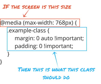
Media query segments
Example of CSS Media query
<!DOCTYPE html>
<html>
<head>
<style>
body {
  background-color: pink;
}

@media screen and (min-width: 480px) {
  body {
    background-color: lightgreen;
  }
}
</style>
</head>
<body>

<h1>Resize the browser window to see the effect!</h1>
<p>The media query will only apply if the media type is screen and the viewport is 480px wide or wider.</p>

</body>
</html>
On this above code you will change of background colour change when have width of 480px or below and it will show the the colour light green. All other circumstances the body colour is set to pink.
Click here to learn about How to connect PHP code to MYSQL db and Mongo db.
Example 2
<!DOCTYPE html>
<html>
<head>
<meta name="viewport" content="width=device-width, initial-scale=1.0">
<style>
.wrapper {overflow: auto;}

#main {margin-left: 4px;}

#leftsidebar {
  float: none;
  width: auto;
}

#menulist {
  margin: 0;
  padding: 0;
}

.menuitem {
  background: #CDF0F6;
  border: 1px solid #d4d4d4;
  border-radius: 4px;
  list-style-type: none;
  margin: 4px;
  padding: 2px;
}

@media screen and (min-width: 480px) {
  #leftsidebar {width: 200px; float: left;}
  #main {margin-left: 216px;}
}
</style>
</head>
<body>

<div class="wrapper">
  <div id="leftsidebar">
    <ul id="menulist">
      <li class="menuitem">Menu-item 1</li>
      <li class="menuitem">Menu-item 2</li>
      <li class="menuitem">Menu-item 3</li>
      <li class="menuitem">Menu-item 4</li>
      <li class="menuitem">Menu-item 5</li>
    </ul>
  </div>

  <div id="main">
    <h1>Resize the browser window to see the effect!</h1>
    <p>This example shows a menu that will float to the left of the page if the viewport is 480 pixels wide or wider. If the viewport is less than 480 pixels, the menu will be on top of the content.</p>
  </div>
</div>

</body>
</html>
Above code will take your full screen size and minimum size as 480px and side bar float left and with a specific size of width. When you minimum the screen more than 480px that rule is not applied to that so it will appear as full screen menu.
References
- Data, R. (2019). CSS Media Queries. [online] W3schools.com. Available at: https://www.w3schools.com/css/css3_mediaqueries.asp [Accessed 23 Aug. 2021].
- Reichenbach, B. (n.d.). Mastering Media Queries [Support Series]. [online] blog.hubspot.com. Available at: https://blog.hubspot.com/customers/mastering-media-queries [Accessed 23 Aug. 2021].checkSave
One thought on “What is media query in CSS and HTML?”